Top 10 ABBA songs

So, the year is almost over, which means it’s all top-ten lists all the time. Lost in Transcription is no different. Do we really need a top-ten ABBA song list, you ask? I mean, aren’t they dead – and Swedish?

Do we need an electric spin-the-bottle game? A motorized ice-cream cone? A combination fork and pizza cutter?

Yes, yes, and yes.

Let’s get started.

10. Lovers (Live a Little Longer)
     The premise in this one is that a woman reads in the paper about a scientific study finding that romance increases lifespan. The science writing apparently moves her to burst into song. The high point is the sassy emphasis on she, indicating that the lead scientist on the study was a womyn.

9. Hey, Hey Helen
     Half feminist anthem, half catty anti-feminist anthem. She’s a single mother, making it on her own, but her children are becoming irrevocably twisted by the absence of a male role model, and will probably wind up being serial killers. Was it worth it? Well, was it?

8. Love Isn’t Easy (But it Sure is Hard Enough)
     Um, what?

7. Kisses of Fire
     Kisses of fire, burnin’ burnin’
     I’m at the point of no returnin’

6. When I Kissed the Teacher
     Companion song to Don’t Stand So Close to Me by the Police. That teacher is SO fired!

5. Bang-a-Boomerang
    Bang a boom a boomerang 
    Dum de dum dum de dum de dum dum
    Bang a boom a boomerang
    Love is a tune you hum de hum hum

4. King Kong Song
     A song about a guy writing a song about watching a King Kong movie. It’s just like Inception. My mind is, like, totally blown.

3. I Do, I Do, I Do, I Do, I Do
     Awesome in part because this is actually the title, with five “I”s, five “Do”s and four commas, and in part because this was the song that my wife and I went back down the aisle to at our wedding.

2. So Long
     In which the narrator repeatedly asserts that she is NOT a prostitute.

1. Waterloo
     Extended “love is war: metaphor. You see, she is defeated utterly and completely by his romantic advances, just like Napoleon was defeated utterly and completely at Waterloo. Then, just like Napoleon, she contracts syphilis and dies alone on an island in the middle of the ocean.

Where are Chiquitita and Dancing Queen, you ask? Yeah, well, where are your mom and the – um – guy – um – who’s not your dad?

Douchebilly of the Magi

So, for Christmas my wife got me an Urban Dictionary mug with the definition of “douchebilly” on it:

A combination of a douchebag and a hillbilly. Not just a douchebag and not just a hillbilly but both! A Douchebilly! 

My ex-husband is a real douchebilly

Why, you ask? Two reasons. First, my wife is AWESOME! Second, this is a word that I made up at a bar, and a friend contributed to Urban Dictionary. It had its origin in an unbearably precious conversation about which Ivy League school was the douchiest. (If it occurs to you to ask, the answer is, “Whichever one you went to.”) I suggested “douchebilly” as the answer posed to the question (asked in reference to me), “What do you call someone with two degrees from Harvard who wears old jeans and cowboy boots?”

I’m telling you this because I hope that you will start using this word all the time, and that you will mail me a nickel every time you do.

You might be wondering, do we really need more words, especially one like “douchebilly”? If the only use for “douchebilly” was to describe me at a bar, well, then you could argue it either way. But I also think that there’s a real need for this word in American political discourse.

For reasons I do not fully understand, American politicians have to downplay their education, upbringing, and accomplishments, at least in certain contexts. If they are not able to do so, they risk losing the votes of people for whom it is critically important that their leaders be “like them.” Bill Clinton grew up poor in Arkansas. He went on to tremendous academic achievements, but maintained a folksy, southern manner that was critical to his political success. I suspect that this was a calculated decision on his part. George Bush was a fifth-generation Yalie. Sure, he grew up partly in Texas, but in incredibly privileged circumstances, and finished high school at Phillips Adademy before going to Yale. The only way he talks like that is through deliberate construction. Even Barack Obama, while running for president, would periodically slide into this vaguely southern accent. Obama did not grow up in privileged circumstances, but the guy is from Hawaii, went to Columbia and Harvard, then moved to Chicago. What’s up with that intermittent accent, then?

And when I say, “I do not fully understand,” what I mean is that I am completely and utterly baffled by this. I don’t want the people in charge of running the country to be like me. I want them to be better than me in every possible way. Maybe if we started referring to politicians as “douchebillies” whenever they actively misrepresent their educational and economic status, we could encourage them to portray themselves more honestly.

Don’t misunderstand me. I am a linguistic relativist, and there is absolutely nothing wrong with a southern, Texas, or any other sort of accent. There is nothing inherent in any accent or dialect that indicates intelligence, or education, or the ability to ably lead. I am also sympathetic to the idea (although I don’t personally feel this way) of having the country run by people who are truly representative of the overall population. The fact is, however, that accents in America are not just regional, but correlate strongly with education level and socio-economic status.

What bothers me is that we have a system ]stocked with a lot of “elites,” as Fox News likes to say, but elites who pander to the public by pretending to be un-elite. Some are self-made, but many were born into privilege. I would love to see more people in government who are intelligent and hard-working, but who are not obscenely wealthy, and do not come from privileged backgrounds. There also seems to be a desire among the electorate to vote for such people. I’m not sure we’re going to get a lot of them, though, so long as all you have to do to come off as a “man of the people” is drawl a little bit.

Like any good American, I have only a passing familiarity with the politics of other countries, so I do not know how wide-spread this phenomenon is. I am heartened, however, by the recent election in Brazil of Tiririca, a 45-year old television clown. Not television clown like Glenn Beck, but television clown like Bozo. He ran on a campaign with slogans like: “What does a federal deputy do? Truly, I don’t know. But vote for me and I will find out for you.” After being elected to congress, Tiririca had to take a literacy test, which he passed after displaying “a minimum of intellect concerning the content of a text despite difficulties in writing.”

Tiririca – NOT a douchebilly – Just awesome.

From Friendster to Wikileaks: In Defense of Oversharing

So, I assume that by now you’ve heard about how Wikileaks is run by traitorous, anarchist terrorists who hate freedom. This is not going to be a post about how the US government’s knee-jerk overreaction, its moronically overinflated rhetoric, or its Orwellian attempts to control what government employees can do in their own homes. You can probably guess my opinions, and others have written on the subject more knowledgeably and compellingly than I would.

I want to write about oversharing more generally.

I’m part of the generation that has spent much of the past five years hand-wringing and tooth-gnashing about how kids these days are posting pictures and videos of themselves drunk and naked, or with their mouths on things that – if only for hygienic reasons – mouths really shouldn’t be on. We worry in print about these kids’ futures. What will happen when a prospective employer or prospective spouse types their name into google twenty years from now? We worry that they fail to understand the consequences of youthful indiscretion in an age where every action is recorded and broadcast.

Don’t get me wrong. I love my generation. Someday, when Ryan Seacrest is the NBC news anchor, he will hire James Frey to ghost-write a book about us called The Most Greatest Generation Ever! But somehow I feel that history will look back on us like the people who fretted about blue jeans, rock and roll music, and comic books. At least, I hope that is true.

I hope that the next generation, immersed as it is in oversharing, learns to admit that people are, well, human. The thing is, everyone does and says stupid things. Everyone always has. Yet, somehow, we’ve painted ourselves into this corner where we all have to pretend to be perfect (at least along certain, critical axes) in our public personas. People who aspire to politics carefully guard what they say for years, so as not to create a sound byte that can be used by their opponents. And somehow, we and the media jump on the bandwagon to vilify people for past indiscretions – even for things that we’ve done ourselves.

The result is that we have a country run predominantly by two sets of people: those who efficiently and ruthlessly fictionalize their own pasts, and those who have lived so carefully that you begin to question the extent to which they have lived at all.

I have done and said stupid and offensive and hurtful things. Am I proud of them? Of course not. But I hope that I have become smarter and better and kinder, and I hope to continue to become smarter and better and kinder in the future. Maybe if everyone’s flaws and mistakes are cataloged on the internet, we can recognize that people are complicated and dynamic. Maybe we can learn to judge people based more on who they are and who they may become, rather than on random, isolated snapshots of who they were at some point in the past.

This is not a relativist argument. I believe that there are good people and bad people. I just think that we would all do a better job of identifying them if we did not have to place so much weight on the little slivers that leak out of the carefully constructed public shells.

The same argument goes for Wikileaks. The US government was embarrassed by the leaking of documents from the state department. Why? I honestly have no idea. Was anyone really surprised that internal memos spoke in frank terms about goals and objectives, about other countries and leaders? Was anyone really surprised to learn that the US uses its political muscle to promote the agendas of US corporations? Does anyone doubt that most of this is fairly vanilla behavior in the world of international diplomacy?

In a world filled with classified documents, fictions develop and take on a life of their own, spinning off their own morality. Governments pretend to be high-minded and moral, which turns out to be somewhat inconsistent with many of the things that real governments need to do in the real world. Then, something leaks out about some government activity, everyone pretends to be surprised and outraged, no matter how trivial or justifiable the infraction. Sometimes the infraction is only against this weird, artificial, fictional morality. But when the response is to enhance secrecy, to reinforce the fiction, it creates the opportunity for the government to do things that truly are horrific.

I have not spent a lot of time looking through the the latest Wikileaks documents, in part because most of them seem dreadfully boring. I’m glad that there are people who are reading these documents, pulling out the interesting bits, and cataloging them. It is conceivable to me that there will be pieces of information here and there that demand immediate action. However, my greater hope is that Wikileaks and its successors will allow us to make our peace with the messiness of government and diplomacy, so that we can focus our outrage on the big infractions.

Some of the Afghan leaks revealed certain atrocities, like the killing of civilians. Most of the reactions that I saw were some version of “It’s just a few bad apples,” “Leaking this will ruin our relationship with the Afghans,” or “America is evil,” all of which miss the point. I believe that the point should be that when you take tens of thousands of kids, some just barely out of high school, and put them halfway around the world in hellish conditions, bad things are going to happen. At some frequency, civilians, including children, are going to be killed. We need to focus on training and policies that keep those incidents to an absolute minimum. AND, we need to understand that this is a part of war, and part of the reason that military intervention needs to be the option of last resort. Secrecy leads to the romanticization of war. Currently, it seems that each generation has to rediscover the horrors of war for itself. Maybe additional transparency would let us hang on to those lessons for longer.

I was not in favor of Rand Paul (although his election has the silver lining of future comic potential), but I would have liked to see the media coverage focus more on his opposition to civil-rights legislation, and less on college pranks involving the “Aqua Bhudda.” Maybe the future will contain copious footage of every Senate candidate being young, naked, and drunk. If we become desensitized to the salaciousness of it all, perhaps the media will cover the substantive philosophical and policy issues that distinguish the candidates.

The future that I am hoping for is not an entirely comfortable one, especially for those of us who came of age before the camera-phone panopticon. But, I want to trust the next generation to turn overshared lemons into lemonade.

In Arthur Miller’s A View from the Bridge, the protagonist, Eddie Carbone lives with his wife, Beatrice, and his niece, Catherine. They house two of Beatrice’s cousins, who are are in the country illegally for work. When Catherine falls in love with one of the cousins, Rodolpho, Eddie’s romantic desires toward his own niece are revealed, and, acting out of jealousy, he turns the cousins over to immigration. The other cousin, Marco, has a starving family back in Italy, and deportation spells disaster for him. Eddie’s betrayal of the cousins ruins him in his community and his family. In the end, Eddie and Marco fight in the street. Eddie pulls a knife, but dies after then knife is turned on him.

The family lawyer and narrator, Alfieri, closes with this:

Most of the time we settle for half and I like it better. But the truth is holy, and even as I know how wrong he was, and his death useless, I tremble, for I confess that something perversely pure calls to me from his memory – not purely good, but himself purely, for he allowed himself to be wholly known and for that I think I will love him more than all my sensible clients. And yet, it is better to settle for half, it must be! And so I mourn him – I admit it – with a certain . . . alarm.

State-by-State FST(ish) Values: The Structure of Racial Diversity in America

So, in the world of population genetics, as in the real world, people are often interested in diversity, and in how that diversity is distributed. In biological contexts, quantifying these things is important because it gives us insight into the processes – like reproduction, migration, selection, etc. – responsible for generating the observed patterns of diversity.

Here I look at how racial diversity is apportioned among counties (or county equivalents) in each of the 50 states, using two different statistics derived from the population genetics and ecology literature. Hit the jump for the analysis, and scroll down to skip the introduction and go straight to the maps.


One of the earliest and most enduring quantities in population genetics is FST. This quantity (along with various closely related “F”s with different subscripts) is an attempt to create a metric of population differentiation that is independent of the overall level of diversity. There are a variety of ways of formulating FST, depending on the type of data you’re thinking about, but all are something like this:

FST = (Db – Dw) / Db

Here, FST is a measure of differentiation between or among subpopulations. Dw is the diversity within subpopulations, and Db is the diversity among subpopulations. As you can see, if you simply double the level of diversity (both within and among subpopulations), this measure of differentiation will be unchanged.

The concept of FST was developed 80-90 years ago, primarily by Sewall Wright, who examined and characterized some of its properties within highly simplified and idealized models of population structure. Then, 40-50 years ago, people started thinking about ways to estimate this quantity from genetic data. A lot of FST-related statistics have been developed, but I will described just one here, which compares the observed and expected levels of heterozygosity:

GST = 1 – HO/HE

HE is the observed level of heterozygosity. Roughly speaking, we look at some gene all of the individuals in the population. Each person has two copies of the gene. If the two copies are the identical, the person is homozygous; if they are different, the person is heterozygous. The observed heterozygosity simply the fraction of people who carry two different copies.

The expected heterozygosity, HE is calculated by taking all of the genes in the population and mixing them together. Now, draw two gene copies at random and ask, what is the probability that the two gene copies are different?

If the population is completely well mixed, HO and HE will be nearly the same, and GST will be close to zero. Elevated levels of GST result from non-random mating. For example, if the population consists of two isolated subpopulations, those subpopulations will tend to contain different versions of the gene, but there will be no one who has one copy of a variant from subpopulation 1 and a variant from subpopulation 2. Thus, there will be a reduced number of heterozygotes in the population, relative to what you would get if you mixed all of the genes in the two subpopulations together.

This notion of heterozygosity is not limited to genetic contexts, however, and we can do the equivalent calculation for any trait that can be divided into distinct categories (even if those categories are somewhat arbitrary social constructs like “race”).

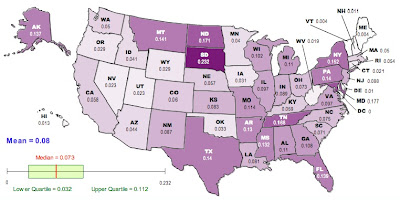
Here’s an illustration. I have taken data from the 2009 American Community Survey, aggregated at the level of individual counties. I calculate the “observed heterozygosity” from the frequencies of different races in each county. Imagine that within each county, we paired people at random. The HO calculated here is the fraction of these randomly paired couples who would have mixed-race children. In this calculation, I have assumed that if one parent self-identifies as “two or more races,” the children are mixed race, independent of the race of the other parent. Also, for simplicity, I have aggregated all subdivisions of “hispanic” into a single category. The HE here is calculated from the same random-mating procedure applied at the level of the entire state.

Here is a map of the results, generated using the free, online map generator from the National Council of Teachers of Mathematics:

Darker colors correspond to higher values of GST.

Now, it has been known for a long time that FST is not particularly well behaved. It is sensitive to things like the total number of distinct gene variants in the population and the total number of subpopulations. Recently, researchers have begun developing corrections to estimators of FST that are more robust to these deviations from the ideal models originally studied by Wright. One such correction was published a couple of years ago by Lou Jost, who proposed a metric, D, which demonstrably has many desirable properties that we would like to see from a statistic that describes population differentiation. In terms of the heterozygosities that go into GST, D is calculated like this:

D = [(HE-HO)/(1-HO)][n/(n-1)]

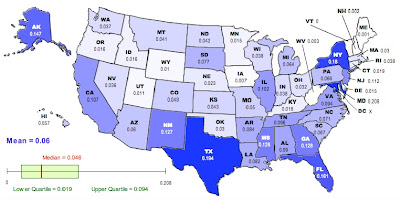
where n is the number of subpopulations. We can recalculate the racial “population differentiation” at the county level for each state. The new map looks like this:

As in the previous map, darker colors represent higher values of D.

Now, there are a lot of reasons to exercise caution in interpreting these values. The Jost correction used to generate the second corrects for certain problems associated with GST, but there is still an issue in that this analysis is based on aggregation at the county level. The geographical extent of counties varies enormously from state to state; the meaning of being in the same county in Utah is quite different from being in the same county in New York. Furthermore, the frequencies and identities of the groups vary among states in a way that will matter much more to any sociological analysis than will the numbers presented here. The FST-related statistics used here have been developed in the context of biological data, with the goal of understanding biological processes that are not necessarily analogous to the social processes that have driven the distribution of various groups in the US.

On the other hand, it is a lot more fun NOT to exercise caution. To that end, here is your list of the ten most racially differentiated states based on Jost’s D (second map):

Maryland, Texas, New York, Florida, Alaska, Mississippi, Georgia, New Mexico, New Jersey, California

And the ten least differentiated:

Vermont, Maine, New Hampshire, West Virginia, Iowa, Wyoming, Utah, Delaware, Minnesota, Idaho

If we go back to the raw GST (first map) the top-ten most differentiated are:

South Dakota, Maryland, North Dakota, Tennessee, New York, Montana, Texas, Pennsylvania, Florida, Alaska

And the least:

Vermont, Maine, Delaware, New Hampshire, Hawaii, West Virginia, Connecticut, Nevada, Utah, Oregon

I will leave irresponsible speculation and stereotyping of the residents of different states as an exercise for the reader.

JOST, L. (2008). GST and its relatives do not measure differentiation
Molecular Ecology, 17 (18), 4015-4026 DOI: 10.1111/j.1365-294X.2008.03887.x
Where stalkers become friends: Geo-tagging on Flickr

So, you probably remember this from the most recent episode of The Mentalist / Bones / Castle / Criminal Minds / Numb3rs:

SEXY YET PROFESSIONAL DETECTIVE: What have we got?

SASSY JUNIOR DETECTIVE: Nothing. All of our leads have dried up like Cher’s ovaries.

GRUFF SENIOR LAW ENFORCEMENT OFFICIAL: We’ve got to wrap this thing up. I’ve got the mayor breathing down my neck.

MAYOR: Hhhhhhhhhh. Hhhhhhhhhh.

G.S.L.E.O.: And now he’s drooling.

S.Y.P.D.: We’ll keep after it, but we’re a bit short-handed after half of the department was beheaded and, ironically, eaten by The Vegan Killer.

G.S.L.E.O.: I don’t want excuses. I want someone behind bars.

S.J.D.: You and my alcoholic ex wife.

SOCIALLY INAPPROPRIATE GENIUS: Actually, we know that the comptroller picked up his dry-cleaning on Wednesday. The same Wednesday that the chimney sweep showed up at the wedding in a curiously un-besooted pair of dungarees. Thus, the heiress was murdered by the delivery man who brought the Martinizing agents to the dry cleaners, also on Wednesday. Also, he was her half brother.

And, scene.

Thanks to research just published in PNAS by a group out of Cornell, we are now one step closer to living in a dystopian panopticon in which our associations can be inferred by any monkey with a laptop. Soon, Patrick Jane will be back to doing parlor tricks, Richard Castle will be back to making a living as an imaginary writer, and everyone else will be in prison for consorting with each other.
More specifically, the authors investigate whether they can infer a social connection between two people on the basis of their having been at the same place at the same time on multiple occasions, using data from Flickr. They look at 38 million pictures that contain both a timestamp and a geo-tag, indicating the time, latitude, and longitude at which the picture was taken. They define a co-occurrence of two Flickr users as having pictures taken within a time t of each other and within the same geographic region: a square(ish) region of length s latitude or longitude degrees on each side. The social dimension of the data comes from Flickr’s networking functions, which allow users to specify their links to others. 
They find that the greater the number of co-occurrences for a pair of users, the more likely it is that they are friends. This is not particularly surprising, although the magnitude of the effects are quite striking. For example, here is one graph from the paper:
Part of Figure 2D from the paper. In this case, the spatial range for co-occurrence is defined by s = 1.0 degrees (about 55 miles by 65 miles where I live). The different curves correspond to different time windows.

The probability that two randomly selected Flickr users are friends is less than 1 in 7000 [Corrected. Original post said 1 in 700]. However, if two users have uploaded pictures from the same 1 degree by 1 degree region within a day of each other on five different occasions, there is nearly a 60% chance that they are friends. If they have done it more than eight times, the chance is more than 90%.

In other words, if you and your accomplice both upload photos from the same dry cleaner every Wednesday, even a non-genius will be able to figure out that you know each other. This is how Strangers on a Train will end in the 2032 remake starring Freddie Highmore and Abigail Breslin.

For those interested in looking at more pretty graphs, the article is Open Access, and can be found here.

For those interested in mounting a futile defense against the Orwellian State, more information about geo-tagging and privacy can be found here, including ways in which you may inadvertently be sharing location information without meaning to.

Crandall, D., Backstrom, L., Cosley, D., Suri, S., Huttenlocher, D., & Kleinberg, J. (2010). Inferring social ties from geographic coincidences Proceedings of the National Academy of Sciences DOI: 10.1073/pnas.1006155107

You and I are going to the top of the charts!

So, a “supergroup” in the UK provided the latest British entry in the ongoing spectacle that I like to call, “What’s Up with People?” This, from the guardian, via Boing Boing:

Later today, Pete Doherty, the Kooks, Billy Bragg, Imogen Heap, Orbital and many more will gather in a London studio, collaborating in a bid for this year’s Christmas No 1. But the strangest bit is not the team-up: it’s that they are not recording a single note. The ad hoc supergroup is assembling in support of Cage Against the Machine, a charity campaign to take John Cage’s infamous 4’33” – a composition of pure silence – to the top of the Yuletide charts.

So many things.

First, referring to a collection of musicians as a “supergroup,” when the headliners are Imogen Heap and the Kooks is like referring to the Pittsburgh Pirates’ “All-Star lineup.”

Second, doesn’t a charity campaign to take a single to the top of the charts sound a bit like a McDonald’s “charity” campaign to sell a lot of Happy Meals?

Third, am I going to be listed in the credits for my performance on the Jingjingler? Are you going to receive royalty payments for your performance on the Floofloober?

Fourth, WTF?

Okay, to be fair, it seems that the proceeds from the record will be going to actual charities. And, also to be fair, I did not actually stand in the studio not playing my Jingjingler for four and a half minutes. I have no information on the whereabouts of you and your Floofloober on Monday.

If you’re like me – and my particular personality disorder makes me assume that you are – you have no idea what is going on here. If you’re in the UK, you’re probably familiar with the backstory, but if not, here is my understanding of the situation. There is a TV program called X Factor, which is the Simon Cowell’s replacement for Pop Idol, which is the off of which American Idol was spun, along with a host of other things. Apparently, for three or four years running, the winner of X Factor would release their record, and it would shoot to the top of the downloads chart around Christmas.

Eventually, some people got fed up, and last year there was a campaign to get people to buy the profanity-heavy “Killing in the Name” by Rage Against the Machine in late December, specifically to keep X Factor winner Joe McElderry out of the top Christmas song spot. And it worked, by something like a factor of 10.

So, this year, there are multiple copy-cat campaigns designed to keep this year’s X Factor winner out of the top spot, including Cage Against the Machine, as well as an apparently much more popular one focused on the 1963 hit “Surfin’ Bird.” In addition to being derivative of last year’s “Killing in the Name” campaign, Cage Against the Machine is also highly reminiscent of a drive from just a couple of months ago to sell copies of “2 minute silence,” a track containing two minutes of silence, a reference to two minutes of silence observed on Remembrance Sunday (think “Veterans’ Day). Apparently the dance group Orbital (think “Neifi Perez“), which is part of the Cage Against the Machine group, released a remix of one of their tracks back in 1994 that consisted entirely of four minutes of silence.

An excerpt from my new novel, 947 Pages. I will be starting a 501(c)3 dedicated to getting onto the New York Times bestsellers list in time for Intergalactic Tutu Day.

Let me be clear. I am 100% behind loosely organized groups of people doing things that are snarky and pointless. And I’m not questioning that the money Cage Against the Machine donates to the British Tinnitus Association will be well spent. I guess. Also, this is not a complaint against conceptual art.

What this is a complaint about is the smug recycling of conceptual art that, in my view, completely misses the point. When Duchamp calls a toilet a fountain, it is a statement – or a question – about what constitutes art. It is a big moment, and one that contributed substantially to a change in our collective perceptions. If I come along 90 years later, take a toilet and call it a fountain, it is just a lazy attempt to embezzle some cultural capital.

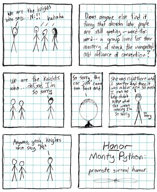
From xkcd:

Ni, Mr. Cage., Ni.

The Distribution of Dominance

So, as you have no doubt surmised from the title of this post, the cash-strapped Republican Party is going to start using their abundant frequent “flyer” points to pay their debts.

I’m kidding, of course. The GOP doesn’t pay its debts!

Actually, we’re going to talk about a paper just out in Genetics by Aneil Agarwal and Michael Whitlock. They provide a very thorough analysis of data on the fitness effects of homozygous and heterozygous gene deletions in yeast.

But let’s back up for a minute first.

The authors are interested in understanding the distribution of dominance, in the population-genetic sense. Traditionally, the dominance is represented by h, and the strength of selection by s. Usually, we define the fitness of the wild-type (hypothetically not carrying any mutations) as 1. Then, we consider the fitness effect of a mutation in a particular gene. In this case, we’re going to focus on deleterious, or harmful mutations, which reduce fitness. If an individual carries two copies of the deleterious mutation, they have a fitness of 1-s, so that small values of s mean weak selection, and large values of s mean strong selection. The dominance refers to the relative fitness of an individual carrying only one copy of the deleterious mutation. This heterozygous fitness is 1-hs. If h equals 1, the deleterious mutation is completely dominant, meaning that having one copy of it is just as bad as having two. If h equals 0, the deleterious mutation is completely recessive, and having one defective copy of the gene is just as good as having two functional copies.

So, what is a typical value of h? Does it depend on s? How much does it vary from gene to gene? The conventional wisdom is that most deleterious mutations are recessive. This is why you should not have children with close relatives. I carry a bunch of recessive mutations, as does my wife. As long as we have different ones, our son inherits a bunch of mutations – but only one copy of each – so they’re recessive in him as well. If we were closely related, we would carry many of the same mutations, and there would be a decent chance that our son would inherit two defective copies of the same gene, which could have various health consequences.

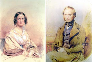
Charles Darwin and his first cousin Emma Wedgwood were married in 1839. 170 years later, they were portrayed by real-life-non-first-cousin couple Paul Bettany and Jennifer Connelly (not pictured).

However, population geneticists don’t care about things like this just because of the implications for human disease. Dominance has a major impact on the eventual fates of individual mutations, and can influence other evolutionary processes, like speciation. Often, in order to model some other process, we have to make some sort of assumption about the distribution of fitness effects of mutations. Traditionally, a researcher would pull this distribution out of his or her asc. This is one of the biggest contributions that this paper will make to the field. It provides a nice, empirically based distribution of dominance effects that can feed into other evolutionary studies.

The results also confirmed (with much greater confidence than was previously the case) the relationship between h and s which had been suggested by some previous studies. They find that larger values of s tend to go with smaller values of h. Consistent with the conventional wisdom about not marrying your cousin, strongly deleterious genes tend to be pretty recessive. More surprisingly, most mildly deleterious mutations had fairly high h values. In fact, the mean value of h over all deleterious mutations was 0.8 – quite dominant. However, when the average is weighted by the fitness effect s, it drops to 0.2.

The authors also point out that this negative relationship between h and s has implications for the evolution of dominance. This pattern is most consistent with theories in which dominance is shaped by indirect selection. For example, deleterious mutations might be recessive if the protein produced by the gene were selected for overexpression to enhance a metabolic pathway, or to buffer the performance of that pathway in certain environments. Then, loss of one copy of the gene encoding that protein might not have a major effect on function (half of too much being still enough). Alternatively, recessiveness could come from feedback mechanisms that upregulate the functional copy of the gene when not enough of the gene product is being made.

The point is that in either of these cases (among others), recessiveness is driven by selection to maintain the function of the gene. The more important the gene is (the larger the value of s associated with it), the stronger this selection will be, and the more recessive deleterious mutations will become. Therefore, mechanisms like these predict the observed negative relationship between h and s.

On a historical note, this type of buffering process was proposed by one of the giants of population genetics, J. B. S. Haldane way back in 1930. Haldane passed away on December 1, 1964.

R. I. P., J. B. S.

Agrawal, A., & Whitlock, M. (2010). Inferences About the Distribution of Dominance Drawn from Yeast Gene Knockout Data Genetics DOI: 10.1534/genetics.110.124560