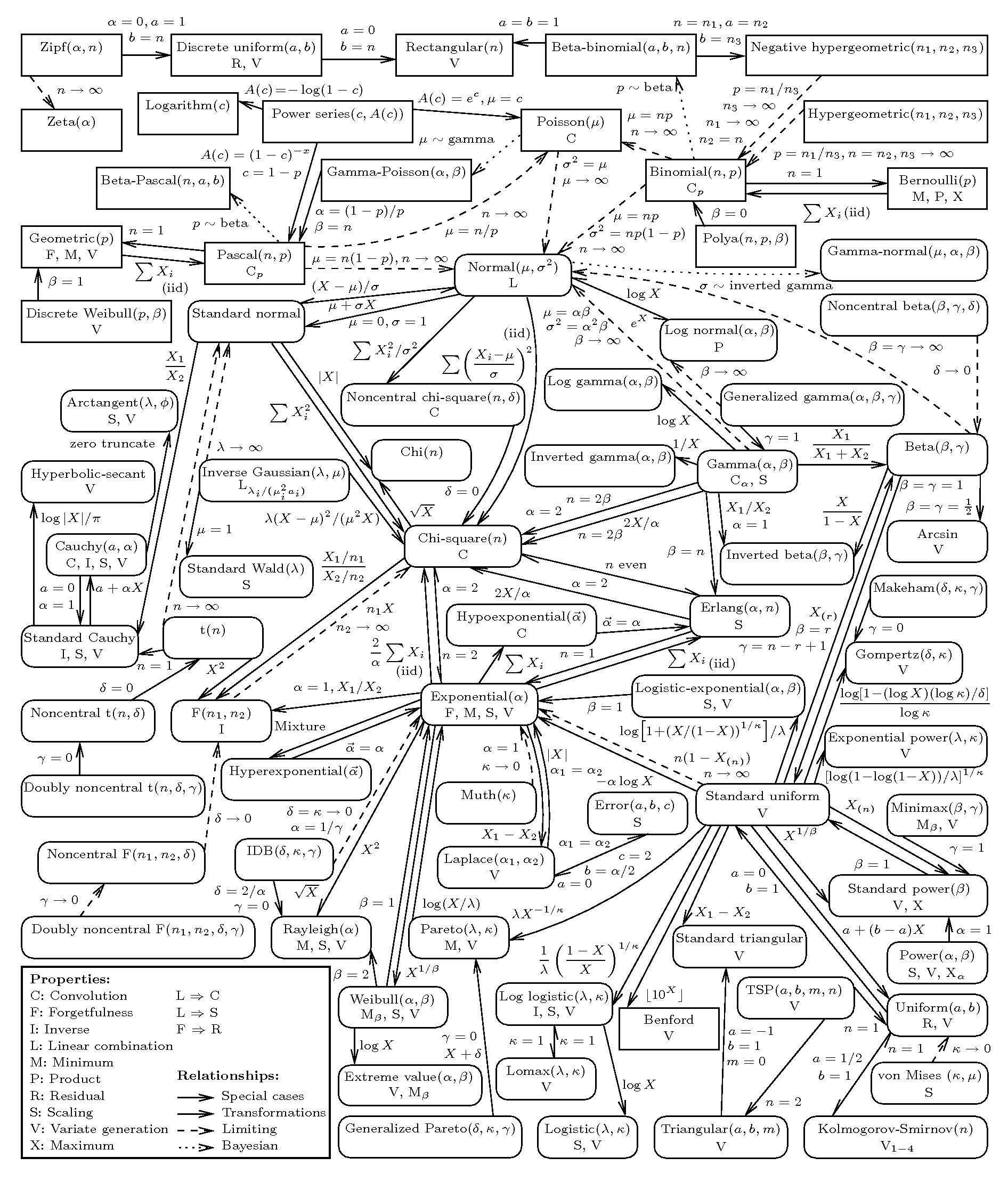
So, this is pretty awesome nerd crack. From College of William and Mary Mathematics Professor Larry Leemis, here is a chart that shows the relationships among most of the univariate distributions you are likely to encounter. Here’s what the overall chart looks like, but if you go to the original (here), you can zoom around. Also, if you click on one of the distributions, it zooms in and highlights the neighbors. Note that the different arrow types indicate different types of relationships (limiting case, transformation, etc.).
Now you can finally adjudicate that game of “Six Degrees of Kevin Bacon’s Discrete Weibull”!
