Category Archives: math

SFI MOOC on Complex Systems

So, are you looking to learn something new this fall? Do you want to understand the difference between things that are “complex” versus “complicated”? Have you always wanted to understand what the hell Jeff Goldblum’s character was talking about in Jurassic Park?

Well, you’re in luck! Check out Introduction to Complexity, a MOOC (Massively Open Online Course) being offered through the Santa Fe Institute. The course is being taught by Melanie Mitchell, a long-time member of the SFI community, and a professor of computer science at Portland State University. She taught this class last year, and all of the feedback I heard was very positive. Now, second time around, I assume that any kinks that might have existed will have been worked out.

The course officially started on September 29, but you can still enroll, since all of the material is online. And, it’s FREE!!

Here’s the official course description:

In this course you’ll learn about the tools used by scientists to understand complex systems. The topics you’ll learn about include dynamics, chaos, fractals, information theory, self-organization, agent-based modeling, and networks. You’ll also get a sense of how these topics fit together to help explain how complexity arises and evolves in nature, society, and technology. There are no prerequisites. You don’t need a science or math background to take this introductory course; it simply requires an interest in the field and the willingness to participate in a hands-on approach to the subject.

And here’s Melanie describing the course:

http://youtu.be/z_MlMLom-es

Check it out, as well as the other courses that will offered in the future through SFI’s Complexity Explorer program: http://www.complexityexplorer.org/online-courses

Relationships among Univariate Distributions

So, this is pretty awesome nerd crack. From College of William and Mary Mathematics Professor Larry Leemis, here is a chart that shows the relationships among most of the univariate distributions you are likely to encounter. Here’s what the overall chart looks like, but if you go to the original (here), you can zoom around. Also, if you click on one of the distributions, it zooms in and highlights the neighbors. Note that the different arrow types indicate different types of relationships (limiting case, transformation, etc.).

Now you can finally adjudicate that game of “Six Degrees of Kevin Bacon’s Discrete Weibull”!

BaseImage


At the Ronin Blog: An Outsider’s Theory of Everything

So, there’s been some buzz in the news the past few days about Eric Weinstein, a non-academic, who presented a lecture at Oxford on a mathematical theory that he has been working on for years. The theory aims to provide a “grand unification” for physics. The lecture and press coverage surrounding it have already received some negative reactions from academic scientists and science writers. Over at the Ronin Blog, I’ve tried to break down and evaluate those criticisms.

E. O. Wilson is Wrong Again — not About Math, but About Collaboration

So, stop me if you’ve heard this one.

Q: What’s the difference between E. O. Wilson and a stopped clock?

A: A stopped clock does not have unlimited access to a national media platform to push its ridiculous ideas on the public.

Bazinga!

A couple of weeks ago, E. O. Wilson published a piece in the Wall Street Journal, where he argued that you don’t need math to be a great scientist. There are two parts of the argument. First, that science is more about conceptual thinking that does not require mathematical formalism to get at great ideas. Second, that when it comes time to mathematize, you can always find a mathematician to collaborate with.

He has already been taken to task in places like Slate and Huffington Post. The criticism in these pieces and most of the grumbling I’ve heard around the internet has been something along the lines of, “Nuh uh! Math is too important!” More specifically, that the era of math-free scientific discovery is over. That to operate at the frontier of science in the twenty-first century, you have to be able to grapple with the mathematical and statistical concepts required in the days of big data.

There’s something to that.

On the other hand, I’m sympathetic to what Wilson is trying to do here. I would hate to see anyone drop out of science because they don’t feel that they can keep up with the math. Of course, that’s partly because I think most people can do more math than they think they can, if you know what I mean.

But what I want to focus on here is Wilson’s view of collaboration. This, even more than math, is going to be the must-have talent of the twenty-first-century scientist. The thing about science is, an awful lot of it has been done. To get to the frontiers of human knowledge requires years of study, and, for those of us without super powers, a lot of specialization. At the same time, the most interesting and important problems often lie between areas of specialization, and require contributions from more than one area. Those most interesting and important problems are going to be solved by teams and networks of people who bring different skills to the table, and who are able to integrate their skills in a way that leads to a whole that is greater than the sum of the parts.

It’s that integration bit, I think, that Wilson does not really get. Wilson’s view of collaboration seems to go something like this: you make some observations about some biology, come up with some ideas, then you go find someone who can translate those into the language of mathematics.

Here’s the thing about translation, though. It can’t be unidirectional, or rather, it shouldn’t be unidirectional. At the risk of something or other (obscurity? pretentiousness?), I’m going to dip into poetry here. Robert Haas (Poet, Berkeley Professor, and Occupy hero), in addition to writing a bunch of his own extraordinary verse, has translated seven volumes of poetry by Czech Nobel laureate Czesław Miłosz. Or, more accurately, he collaborated with Miłosz to produce those translations.

After Miłosz’s death, Haas included their translation of Czesław Miłosz’s poem “O!” in his own volume Time and Materials. The poem is prefaced with this note about the translation process:

In his last years, when he had moved back to Kraków, we worked on the translation of his poems by e-mail and phone. Around the time of his ninetieth birthday, he sent me a set of poems entitled “Oh!” I wrote to ask him if he meant “Oh!” or “O!” and he asked me what the difference was and said that perhaps we should talk on the phone. On the phone I explained that “Oh!” was a long breath of wonder, that the equivalent was, possibly, “Wow!” and that “O!” was a caught breath of surprise, more like “Huh!” and he said, after a pause, “O! for sure.”  Here are the translations we made:

Now, if you’re not a writer and/or avid reader of poetry, it may seem strange to fuss over the difference between “Oh!” and “O!” But worrying about the difference between “Oh!” and “O!” is precisely the sort of thing that differentiates poetry from other forms of writing. Robert Frost famously defined poetry as “what gets lost in translation.” One way to unpack that statement is to say that translation can typically capture the basic meaning of words and phrases, but the part of writing that is poetry is the part that goes beyond that basic meaning. Poetry is about subtle differences in meaning. It is about connotation and cultural resonance. It is about the sounds that words make and the emotional responses that they trigger in someone who has encountered that word thousands of times before, in a wide variety of contexts.

These things almost never have simple one-to-one correspondences from one language to another. That means that a good translation of poetry requires a back-and-forth process. If you have a translator who is truly fluent in both languages — linguistically and culturally — this back-and-forth can happen within the brain of the translator. But, if your translation involves two people, who each bring their expertise from one side of the translation, they have to get on the phone every so often to discuss things like the difference between “O!” and “Oh!”

Doing mathematical or theoretical biology is exactly like this.

The theories and observations that build up in the biological domain exist in a language that is profoundly different from the language of mathematics. For theory in biology to be both accurate and relevant, it has to stay true to both of these languages. That means there has to be a vibrant, even obsessive, back-and-forth between the biological observations and concepts and the mathematical representations that attempt to capture and formalize them.

As in the poetry case, if you, as an individual scientist, have a deep understanding of the biology and a fluency in the relevant mathematics, that back-and-forth can happen in your own brain. Where E. O. WIlson is right is in his assertion that, if you don’t have the math, you can still make a contribution, by focusing on building your deep understanding of the biology, and then by finding yourself a mathematician you can collaborate with.

But there’s a trick.

If you’re going to follow this route, you have to sit down with your mathematician, and you have to walk through every single equation. You have to press them on what it means, and you have to follow the thread of what it implies. If you’re the mathematician, you have to sit down with your biologist and say, “If we assume A, B, and C, then mathematically that implies X, Y, and Z.” You have to understand where, in the biology, A, B, and C come from, and you have to work together to discover whether or not X, Y, and Z make any sense.

Basically, each of you has to develop some fluency in the other’s language, at least within the narrow domain covered by the collaboration. If you’re not willing to put in this level of work, then yes, you should probably consider a different career.

Now, maybe you think I’m being unfair to Wilson here. After all, he doesn’t explicitly say that you should hand your ideas over to the mathematicians and walk away. And obviously, I don’t have any privileged access to the inner workings of Wilson’s brain or the nature of his collaborations.

But let’s go back to a couple of years ago, when he collaborated with Martin Nowak and Corina Tarnita to write a controversial paper in which they argued that modeling the evolution of social behaviors based on “kin selection” was fundamentally flawed. That paper elicited a response from the community that is rare: multiple responses criticizing the paper on multiple fronts, including one letter (nominally) co-authored by nearly 150 evolutionary biologists.

I won’t go into the details here, as I have written about the paper and the responses multiple times in the past (here and here, in particular, or you can just watch my video synopsis of the criticism here).

Briefly, the controversial article (published in Nature, arguably the most prestigious journal for evolutionary biologists), completely misinterprets, misrepresents, and/or ignores the work done by other people in the field. It’s a little bit like if you published a physics paper where you said, “But what if the speed of light is constant in different frames of reference? No one has ever thought of that, so all of physics is wrong!” That’s an exaggeration, of course, but the flaws in Wilson’s paper are of this general type.

The weird thing about the paper is that it includes an extensive supplement, which cites much of the literature that is disregarded by the main text of the paper. It is exactly the sort of error that happens when you have something that is written by a disconnected committee, where the right hand does no know what the left hand is doing. Basically, it is hard to imagine a scenario in which someone could actually have understood the papers that are cited and discussed in the supplementary materials, and then turned around and, in good faith, have written that paper.

That leaves us with a few possible explanations. It could be that the authors were just not smart enough to understand what they were talking about. Or it could be that they deliberately misrepresented prior work to make their own work seem more original and important. For the purposes of our discussion here, let’s assume that neither of these explanations is accurate.

Instead, let’s assume that everyone involves is fundamentally competent, and was acting in good faith. In that case, perhaps the problem came from a failure of collaboration. E. O. Wilson probably knows more than just about anyone else in the world about the biology underlying the evolution of social behavior — especially among eusocial insects. Martin Nowak is a prominent and prolific mathematical biologist. Corina Tarnita was a postdoc at the time, with a background primarily in mathematics.

Wilson, as he acknowledges, lacks the mathematical skills required to really understand what the models of kin selection do and do not assume and imply. Tarnita, I imagine, has these skills, but as a young researcher coming out of math, perhaps lacked the biological knowledge and the perspective on the field to understand how the math related to the prior literature and the state of the field. Nowak, in principle, had both the mathematical skills and the biological experience to bridge this gap. He’s a curious case, though, as he, rather famously in the field, is interested in building and solving models, and has little interest in what has been done by other people, or in chasing down the caveats and nuanced implications of his work.

Among the three of them, Wison, Nowak, and Tarnita have all of the skills and knowledge required to write an accurate analysis of models of kin selection. But if assembling the requisite skills was all that was necessary, that Nature paper would have been very different — in much the same way that you could dump a pile of gears, shafts, and pistons in my driveway, and I could drive away in a Camaro.

The challenge of interdisciplinary collaboration is to combine your various skills in a way that creates something greater than the sum of the parts. If you can master this, you’ll be able to make great contributions to whatever field you apply your skills and interests to.

In the case of Wilson’s disastrous paper, what we got was a situation where the deficits that each of the researchers brought to the table combined to create something greater than the sum of the parts. Sadly, I get the feeling that Wilson does not understand this difference, that he thinks collaborating with mathematicians means explaining your intuition, and then waiting for them to “prove” them.

So, yes, you can be a great scientist in the twenty-first century, even if you don’t have great mathematical skills yourself. But, just as Robert Haas called up Czesław Miłosz on the phone to discuss the difference between “O!” and “Oh!” maybe you’re going to have to call up your mathematician collaborators to talk about the difference between O(x) and o(x). You don’t necessarily have to understand the difference in general, but you do need to understand the difference and its implications in the context of the system you’re studying, otherwise you’re not really doing science at all.

How Many English Tweets are Actually Possible?

So, recently (last week, maybe?), Randall Munroe, of xkcd fame, posted an answer to the question “How many unique English tweets are possible?” as part of his excellent “What If” series. He starts off by noting that there are 27 letters (including spaces), and a tweet length of 140 characters. This gives you 27140 — or about 10200 — possible strings.

Of course, most of these are not sensible English statements, and he goes on to estimate how many of these there are. This analysis is based on Shannon’s estimate of the entropy rate for English — about 1.1 bits per letter. This leads to a revised estimate of 2140 x 1.1 English tweets, or about 2 x 1046. The rest of the post explains just what a hugely big number that is — it’s a very, very big number.

The problem is that this number is also wrong.

It’s not that the calculations are wrong. It’s that the entropy rate is the wrong basis for the calculation.

Let’s start with what the entropy rate is. Basically, given a sequence of characters, how easy is it to predict what the next character will be. Or, how much information (in bits) is given by the next character above and beyond the information you already had.

If the probability of a character being the ith letter in the alphabet is pi, the entropy of the next character is given by

– Σ pi log2 pi

If all characters (26 letter plus space) were equally likely, the entropy of the character would be log227, or about 4.75 bits. If some letters are more likely than others (as they are), it will be less. According to Shannon’s original paper, the distribution of letter usage in English gives about 4.14 bits per character. (Note: Shannon’s analysis excluded spaces.)

But, if you condition the probabilities on the preceding character, the entropy goes down. For example, if we know that the preceding character is a b, there are many letters that might follow, but the probability that the next character is a c or a z is less than it otherwise might have been, and the probability that the next character is a vowel goes up. If the preceding letter is a q, it is almost certain that the next character will be a u, and the entropy of that character will be low, close to zero, in fact.

When we go to three characters, the marginal entropy of the third character will go down further still. For example, t can be followed by a lot of letters, including another t. But, once you have two ts in a row, the next letter almost certainly won’t be another t.

So, the more characters in the past you condition on, the more constrained the next character is. If I give you the sequence “The quick brown fox jumps over the lazy do_,” it is possible that what follows is “cent at the Natural History Museum,” but it is much more likely that the next letter is actually “g” (even without invoking the additional constraint that the phrase is a pangram). The idea is that, as you condition on longer and longer sequences, the marginal entropy of the next character asymptotically approaches some value, which has been estimated in various ways by various people at various times. Many of those estimates are in the ballpark of the 1.1 bits per character estimate that gives you 1046 tweets.

So what’s the problem?

The problem is that these entropy-rate measures are based on the relative frequencies of use and co-occurrence in some body of English-language text. The fact that some sequences of words occur more frequently than other, equally grammatical sequences of words, reduces the observed entropy rate. Thus, the entropy rate tells you something about the predictability of tweets drawn from natural English word sequences, but tells you less about the set of possible tweets.

That is, that 1046 number is actually better understood as an estimate of the likelihood that two random tweets are identical, when both are drawn at random from 140-character sequences of natural English language. This will be the same as number of possible tweets only if all possible tweets are equally likely.

Recall that the character following a q has very low entropy, since it is very likely to be a u. However, a quick check of Wikipedia’s “List of English words containing Q not followed by U” page reveals that the next character could also be space, a, d, e, f, h, i, r, s, or w. This gives you eleven different characters that could follow q. The entropy rate gives you something like the “effective number of characters that can follow q,” which is very close to one.

When we want to answer a question like “How many unique English tweets are possible?” we want to be thinking about the analog of the eleven number, not the analog of the very-close-to-one number.

So, what’s the answer then?

Well, one way to approach this would be to move up to the level of the word. The OED has something like 170,000 entries, not counting archaic forms. The average English word is 4.5 characters long (5.5 including the trailing space). Let’s be conservative, and say that a word takes up seven characters. This gives us up to twenty words to work with. If we assume that any sequence of English words works, we would have 4 x 10104 possible tweets.

The xkcd calculation, based on an English entropy rate of 1.1 bits per character predicts only 1046 distinct tweets. 1046 is a big number, but 10104 is a much, much bigger number, bigger than 1046 squared, in fact.

If we impose some sort of grammatical constraints, we might assume that not every word can follow every other word and still make sense. Now, one can argue that the constraint of “making sense” is a weak one in the specific context of Twitter (see, e.g., Horse ebooks), so this will be quite a conservative correction. Let’s say the first word can be any of the 170,000, and each of the following zero to nineteen words is constrained to 20% of the total (34,000). This gives us 2 x 1091 possible tweets.

That’s less than 1046 squared, but just barely.

1091 is 100 billion time the estimated number of atoms in the observable universe.

By comparison, 1046 is teeny tiny. 1046 is only one ten-thousandth of the number of atoms in the Earth.

In fact, for random sequences of six (seven including spaces) letter words to total only to 1046 tweets, we would have to restrict ourselves to a vocabulary of just 200 words.

So, while 1046 is a big number, large even in comparison to the expected waiting time for a Cubs World Series win, it actually pales in comparison to the combinatorial potential of Twitter.

One final example. Consider the opening of Endymion by John Keats: “A thing of beauty is a joy for ever: / Its loveliness increases; it will never / Pass into nothingness;” 18 words, 103 characters. Preserving this sentence structure, imagine swapping out various words, Mad-Libs style, introducing alternative nouns for thing, beauty, loveliness, nothingness, alternative verbs for is, increaseswill / pass prepositions for of, into, and alternative adverbs for for ever and never.

Given 10000 nouns, 100 prepositions, 10000 verbs, and 1000 adverbs, we can construct 1038 different tweets without even altering the grammatical structure. Tweets like “A jar of butter eats a button quickly: / Its perspicacity eludes; it can easily / swim through Babylon;”

That’s without using any adjectives. Add three adjective slots, with a panel of 1000 adjectives, and you get to 1047 — just riffing on Endymion.

So tweet on, my friends.

Tweet on.

C. E. Shannon (1951). Prediction and Entropy of Written English Bell System Technical Journal, 30, 50-64

Rough Day for Liberal Tigers Fans

So, remember how there was this election? And how there was this guy Nate Silver who said that Obama was going to win the election? But the all the conservatives everywhere were like “Nuh-uh!” because they weren’t going to just listen to some “blogger” who was using his “math” and “statistics” to pursue his gay agenda of using mind control to hand over the United States over to the one-world government and forcibly relocating all of the suburbanites? I mean, what about the conventional wisdom of Peggy Noonan’s friends?

Remember how he then became the darling of everyone on the left, who were all able to embrace his analyses while patting themselves on the back for being reality based? Because, in this case, reality did, in fact have a liberal bias that was, in fact, more extreme than that of the liberal-bias machine of the Main Stream Media. (Someone should come up with a clever, dismissive name for them, maybe “Lame Stream Media”! Ooh, I like that!)

Remember how part of you wondered what would have happened if the statistical analyses of Nate Silver (or the equally awesome – but much funnier – Sam Wang) had pointed towards a Romney victory? Would conservatives have embraced the hard-nosed, numbers-based approach? Would liberals have set up hysterical unskewing sites?

Well, here’s our chance to find out.

We need to collect together all the people who were Obama supporters and Nate Silver fans, and who are also Detroit Tigers fans. We then need to see what they have to say about the column that Silver wrote yesterday.

In it, Silver lays out, with his typical clarity, the case that Miguel Cabrera does not deserve to be the American League MVP, despite his being the first triple-crown winner since the debut of Laugh-In. Rather, on purely statistical grounds, the MVP should go to Mike Trout of the California Angels Anaheim Angels Los Angeles Angels of Anaheim. Purely based on his performance as a batter, Trout provided greater added value to his team than Cabrera did to his. Beyond that, Trout was a huge asset both as a fielder and as a baserunner. Cabrera, by contrast, provided a net negative contribution to his team in fielding and baserunning.

Really, the only argument in Cabrera’s favor is that he won the triple crown. The triple crown! That’s a real achievement, and he should be rewarded for it. But should he be rewarded with the MVP? Or should that go to the most valuable player? If we apply the conventional meanings of the words “most,” “valuable,” and “player,” the MVP should go to Trout.

Maybe we could come up with something else to honor Cabrera’s extraordinary accomplishment in earning the triple crown. How about, I don’t know, the triple crown? (Last three words said extra loud, slack-jawed, and condescendingly.)

I’m just saying. If you spent October laughing at Karl Rove and Dick Morris (and who didn’t, really), but think that Cabrera should win the MVP, you’re not a realist. You’re a partisan who happens to have been on the right side of reality in the election, but who is now on the wrong side of reality in baseball.

Happy Pi Day

So, how are you celebrating Pi Day?  If you’re like most Americans, it’s by beginning the three-day process of deluding yourself into believing that you have some non-negligible Irish ancestry.

Here’s what you should be doing instead:

Note: this song appears in many, many versions on the web, and, to be honest, I don’t know what the appropriate attribution is. I picked this one because I like the video.  If you know where origination credit should go, let me know in the comments.

Darwin Eats Cake Valentine’s Day Cards

So, it’s almost Valentine’s Day here in the States, and you’ve forgotten to buy something for your spouse / fiancé(e) / boy- and/or girl-friend. Fortunately, we’ve got you covered. Just print out these handy-dandy Valentine’s Day cards, and you’re all set.

If you’re in Australia, Valentine’s Day is already half over, and while you also forgot to buy anything for your special someone, you’ll get away with it, because sheep never know what day it is.

Higher-resolution versions can be found over at Darwin Eats Cake.

Welcome back to the obscurity

So, I just got back from a NESCent catalysis meeting, and boy is the free energy of my transition state reduced!

There’s been a lack of bloggage over the past week, since I was actually off doing some science, or, rather, talking with people who have been doing actual science. When you’re a theorist, it’s a fine line.

[Note to self: include clever transition here before posting.]

Which brings us, obviously, to the latest two Darwin Eats Cake strips, which feature abusively obscure equation-themed humor:

Best URL for sharing: http://www.darwineatscake.com/?id=80
Permanent image URL for hotlinking or embedding: http://www.darwineatscake.com/img/comic/80.jpg

Best URL for sharing: http://www.darwineatscake.com/?id=81
Permanent image URL for hotlinking or embedding: http://www.darwineatscake.com/img/comic/81.jpg

What power laws actually tell you about wealth and the 1%

So, there’s an article published in yesterday’s Guardian titled, “The mathematical law that shows why wealth flows to the 1%,” which is fine, except for the fact that the “law” is not really a law, nor does it necessarily show “why” wealth flows anywhere.

To be fair, it’s a perfectly reasonable article with a crap, misleading headline, so I blame the editor, not the author.

The point of the article is to introduce the idea of a power law distribution, or heavy-tailed distributions more generally. These pop up all over the place, but are something that many people are not familiar with. The critical feature of such distributions, if we are talking about, say, wealth, is that an enormous number of people have very little, while a small number of people have a ton. In these circumstances it can be misleading, or at least uninformative, to talk about “average” wealth.

The introduction is nicely done, and it represents an important part of the “how” of wealth is distributed, but what, if anything, does it tell us about the “why”?

To try to answer that, we’ll walk through three distributions with the same “average,” to see what a distribution’s shape might tell us about the process that gave rise to it: Normal, Log Normal, and Pareto.

The blue curve, with a peak at 300, is a Normal distribution. The red curve, with its peak around 50, is a Log Normal. The yellow one, with its peak off the top of the chart at the left, is a Pareto distribution.
In each case, the mean of the distribution is 300.

The core of the issue, I think, is that there are three different technical definitions that we associate with the common-usage term “average,” the mean, the median, and the mode. This is probably familiar to most readers who have made their way here, but here’s a quick review:

The mean is what you usually calculate when you are asked to find the average of something. For instance, you would determine the average wealth of a nation by taking its total wealth and dividing it by the number of people.
The median is the point where half of the distribution lies to the right, and half lies to the left. So the median wealth would be the amount of money X where half of the people had more than X and half had less than X.
The mode is the high point in the distribution, its most common value. In the picture above, the mode of the blue curve is at about 300, while the mode of the red curve is a little less than 50.
The Normal (or Gaussian, or bell-curve-shaped) distribution, represented in blue, is probably the most familiar. One of the features of the Normal distribution is that the mode, median, and mean are all the same. So, if you have something that is Normally distributed, and you talk about the “average” value, you are probably also talking about a “typical” value. 
Lots of things in our everyday experience are distributed in a vaguely Normal way. For instance, if I told you that the average mass of an apple was 5 ounces, and you reached into a bag full of apples, you would probably expect to pull out an apple that was somewhere in the vicinity of 5 ounces, and you might assume that you would be as likely to get an apple that was bigger than that as you would be to get one that was smaller. Or if I told you that the average height in a town in 5 feet, 8 inches, you might expect to see reasonable numbers of people who were 5’6″, fewer who were 5’2″, and fewer still who were 4’10”.
So what sorts of processes lead to a Normal distribution? The simplest way is if you have a bunch of independent factors that add up. For example, it is thought that a large number of genes affect height, with the specific variants of each gene that you inherited contributing a small amount to making you taller or less tall, in a way that is close enough to additive.

What would it mean, then, if we were to find that wealth was Normally distributed? Well, it could mean a lot of things, but a simple model that could give rise to a Normal wealth distribution would be one where the amount of pay each person received each week was randomly drawn from the same distribution. Maybe you would flip a coin, and if it came up heads, you would get $300, while tails would get you $100. Pretty much any distribution would work, as long as the same distribution applied to everyone. After many weeks, some people would have gotten more heads, and they would be in the right-hand tail of the wealth distribution. The unlucky people who got more tails would be in the left-hand tail. But most people’s wealth would be reasonably close to the mean of the wealth distribution.
Image from Alex Pardee‘s 2009 exhibition “Hiding From The Normals”
Now, it’s important to remember that just because a particular mechanism can lead to a particular distribution, observing that distribution does not prove that your particular mechanism was actually at work. It seems like that should be obvious, but you actually see a disturbing number of scientific papers that basically make that error. There will typically be whole families of mechanisms that can give rise to the same outcome. However, looking at the outcome (the distribution, in this case) and asking what mechanisms are consistent with it is an important first step.
Alright, now let’s talk about the Log Normal distribution (the red one). Unlike the Normal, the Log Normal is skewed: it has a short left tail and a long right one. This means that the mean, mode, and median are no longer the same. In the curve I showed above, the mean is 300, the median is about 150, and the mode is about 35. 
This is where talk about averages can be misleading, or at least easily misinterpreted. Imagine that the wealth of a nation was distributed like the red curve, and that I told you that the average wealth was $30,000. What would you think? Well, if I also told you that the wealth was Log Normally distributed, and I gave you some additional information (like the median, or the variance), you could reconstruct complete distribution of wealth, at least in principle.
The problem is that we tend to think intuitively in terms of distributions that look more like the Normal. In practice, we hear $30,000 average wealth, and we say, “Hey, that’s not too bad.” We probably don’t consciously recognize that (in this example), half of the people actually have less than $15,000, and that the typical (i.e., modal) person has only about $3500.
What type of process can give rise to a Log Normal distribution? Well, again, there are many possible mechanisms that would be consistent with a Log Normal outcome, but there is a class of simplest possible underlying mechanisms. We imagine something like the coin toss that we used in the Normal case, but now, instead of adding a random quantity with each coin toss, we multiply.
This is sort of like if everyone started off with the same amount of money invested in the stock market. Each week, your wealth would change by some percentage. Some weeks you might gain 2%. Other weeks you might lose 1%. If everyone is drawing from the same distribution of multipliers (if we all have the same chance of a 2% increase, etc.), the distribution of wealth will wind up looking Log Normally distributed.
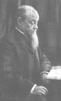
Vilfredo Pareto, who grew a very long beard in order to illustrate the idea of a distribution with a very long tail.
Finally, we come to the Pareto distribution. This is sort of like the Log Normal, but much more skewed. In the graph we started off with, the yellow Pareto distribution has a mean of 300, just like the Normal and Log Normal. But where the Normal had a median of 300, and the Log Normal had a median of 150, the Pareto had a median of only about 20. 
In our wealth example, we could say that that average wealth in a nation was $30,000, but if that wealth was distributed like the yellow Pareto curve, half of the people in that nation would have less than $2000. Furthermore, 97% of the people in that nation would have less than that $30,000 average.
With a Pareto, the mode is as far left as we set the minimum value. In this case, it was set at 10. Under such a distribution, the “typical” person has as little wealth as possible.
The fact is, this extremely skewed sort of distribution, a Pareto or something like it, is what real-world wealth distributions tend to look like. [UPDATE: This is true of the rich, right tail of the distribution. The body of wealth distributions are more Log Normal. H/T Cosma Shalizi.]
The greatest success so far of the Occupy Wall Street movement may be that it is starting to make people understand just how skewed the distributions of wealth and income are, in this country and around the world. A graph posted Friday on Politico shows the dramatic increase in the discussion of “income inequality” in the news over the past several weeks:
Dylan Byers plotted the number of times “income inequality” was mentioned in print news, web stories, and broadcast transcripts each week. The graph reveals a five-fold increase over the past two months.
Consider that along with this graph, which is part of a nice set of illustrations of American inequality put together by Mother Jones:  
This graph reveals two things. First, that Americans think that wealth should be more equally distributed. Second, and more importantly for the sake of the current discussion, they dramatically underestimate the extent of the inequality that actually exists. 
In the terms that we have been using here (and speaking very loosely), Americans think that wealth should be somewhat Normally distributed. They think that it is more Log Normally distributed. They fail to recognize that, in reality, it is more like Pareto distributed. 
What types of processes can give rise to a Pareto distribution? Again, lots. What are the simplest models, though? Generative models that give rise to this sort of distribution tend to have some sort of positive feedback mechanism. Basically, the more money you have, the more leverage you have to make money in the future. In the simple models, you can start off with a bunch of things that are identical (like our nation of people who all start off with the same amount of money to put in the stock market). But now, if you do well, it increases your chances of doing well in the future: the people whose coins come up heads in the first few rounds are given new coins, which come up heads more than half of the time. 
It is easy to list the features of our current economic system that lead to this sort of positive feedback loop: successful companies have the resources to undermine and disrupt smaller competitors, the rich have the ability through advertising and lobbying to steer public opinion and write public policy. If you didn’t read it when it came out, or haven’t read it recently, the Vanity Fair piece from May, “Of the 1%, by the 1%, for the 1%” provides an excellent overview of how increasing inequality leads to reduced opportunity, which leads, in turn, to further increases in inequality. 
Power laws and Pareto distributions don’t show how or why wealth flows into the hands of the few. However, the nature and magnitude of wealth inequality hint at truths that we already know from experience: that wealth begets wealth, that the playing field is not always level, and that when inequality becomes great enough, hard work and ingenuity may have a hard time competing with privilege and access.
========================================================
In the “real” world of empirical data, there are two kinds of power laws: things that are actually power laws, and things that are not really power laws, but get called power laws because science thinks that’s sexier.
I think someone once said, “God grant me the the serenity to accept the things that are not power laws, the appropriate statistical tools to fit those that are, and the wisdom to know the difference.”
If the God thing doesn’t work out for you, a good back-up plan starts with this paper:

Clauset, A., Shalizi, C., & Newman, M. (2009). Power-Law Distributions in Empirical Data SIAM Review, 51 (4) DOI: 10.1137/070710111

Free version of the article available on the ArXiv, here: http://arxiv.org/abs/0706.1062