After the continuation of net neutrality and the onset of the llama revolution, the most exciting thing to hit the internet yesterday was this dress, which some people claim is white and gold, while others claim it is blue and black.

Buzzfeed has been running a poll. As of right now, the results are running 71% white and gold versus 29% blue and black. Gawker media is also on the case, concluding that everyone is an idiot, while Slate says you’re looking at the dress wrong.
Here’s what I think is going on. First off, here are the two colors, extracted from the image and presented out of context:

To me, that’s a sort-of steely blue-gray on the left and brown with maybe a hint of gold on the right. According to Adobe Illustrator, the RGB values are: R: 140, G: 146, B: 185 on the left and R: 137, G: 115, B:81 on the right. Depending on where, exactly you sample from, the values vary a bit, obviously, but are always pretty close to these.
In each case, these values are on a scale that runs from 0 to 255. So that means the Red and Green channels are running at about 50% in both cases. If all three were 50%, we would have something that looked like a middle-of-the-road gray. Relative to that, we have some extra blue on the left, and we have some blue taken away on the right. So we can think of the blue-gray as a bluish gray. The brown we can think of as a yellowish gray, or maybe an orangish gray.

So, those are the actual colors in the picture, but the color of the dress is a different question. Why is it that some people look at the top photo and see a white dress with gold trim, while others see a blue dress with black trim?
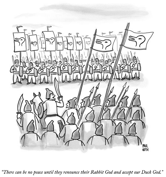
What I think we have here is a case where there are two different effects, both relating to the fact that our perception of colors is affected by context. What is special in this case is that the two effects are pushing our perception in opposite directions. Plus, they are balanced in magnitude, so which of the two dominates varies from person to person, and can be influenced by little details, like the angle at which you view your computer screen, background lighting, etc. In fact, some people see the colors spontaneously flipping from white-gold to blue-black or vice versa. It’s basically this thing from the New Yorker:
The first effect is we perceive colors in a way that enhances their contrast with nearby colors. Look at these boxes. If you’re like most people, the small square on the left looks like it is a lighter color of gray than the small square on the right:
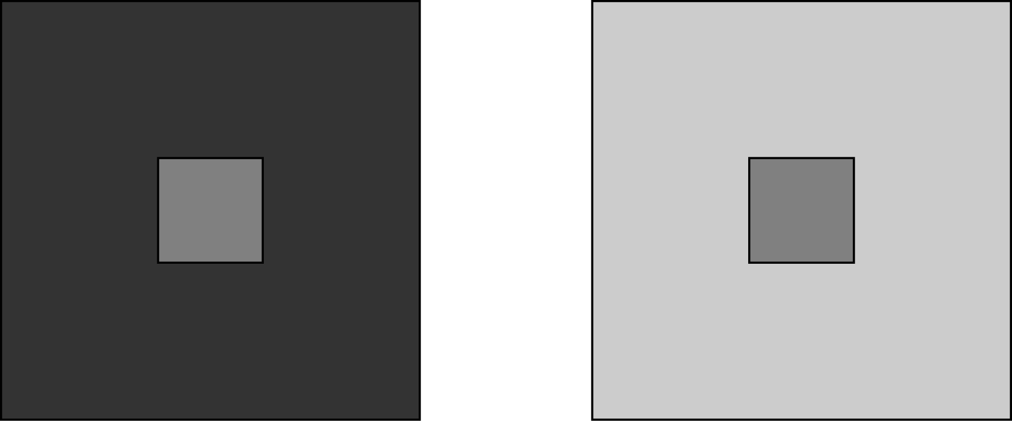
But in fact, those two center squares are exactly the same shade of gray. The one on the left looks lighter because it is surrounded by a darker gray. The one on the right looks lighter because it is surrounded by a lighter gray. Here are the same two squares with the context removed:

This is a perfectly reasonable thing for your eyes to do, because, in the real world, the intensity of light in the environment varies. If you’re looking for berries to eat, you want to perceive a strawberry in a shady spot as the same type of thing as a strawberry in a sunny spot. So, when everything is dark and shady, you correct your perception, saying essentially that this strawberry must actually be brighter than it looks. Similarly under bright sunlight, you would (correctly) infer that the berry is actually darker than it appears.
The color surrounding much of the dress in the photo is a very bright white. In this context, we perceive the colors as being darker and more saturated than they are, yielding a rich blue and a very dark brown verging on black.
But there’s another way that this correction can play out. Look at this picture:

The punchline here is that the squares labeled A and B are actually exactly the same color (as illustrated in the lower-left corner of the photo. Here, part of the effect is due to the fact that square A is surrounded by lighter squares, and therefore appears darker than it is, while square B is surrounded by darker squares, and appears lighter. But another part of the effect is due to the fact that we perceive a light source off to the right, and we see that the green cylinder is casting a shadow. Since we know that square B is in this shadow, we correct for this, perceiving it not as a gray square, but as a white square that is in the shadows.
In the dress picture, the light is coming from behind the dress, so the entire side of the dress that we can see is in its own shadow. We correct for this by perceiving not a blue-gray dress, but a white dress that has been photographed with horrible backlighting. We implicitly assume that the darkness is an artifact of the photograph.
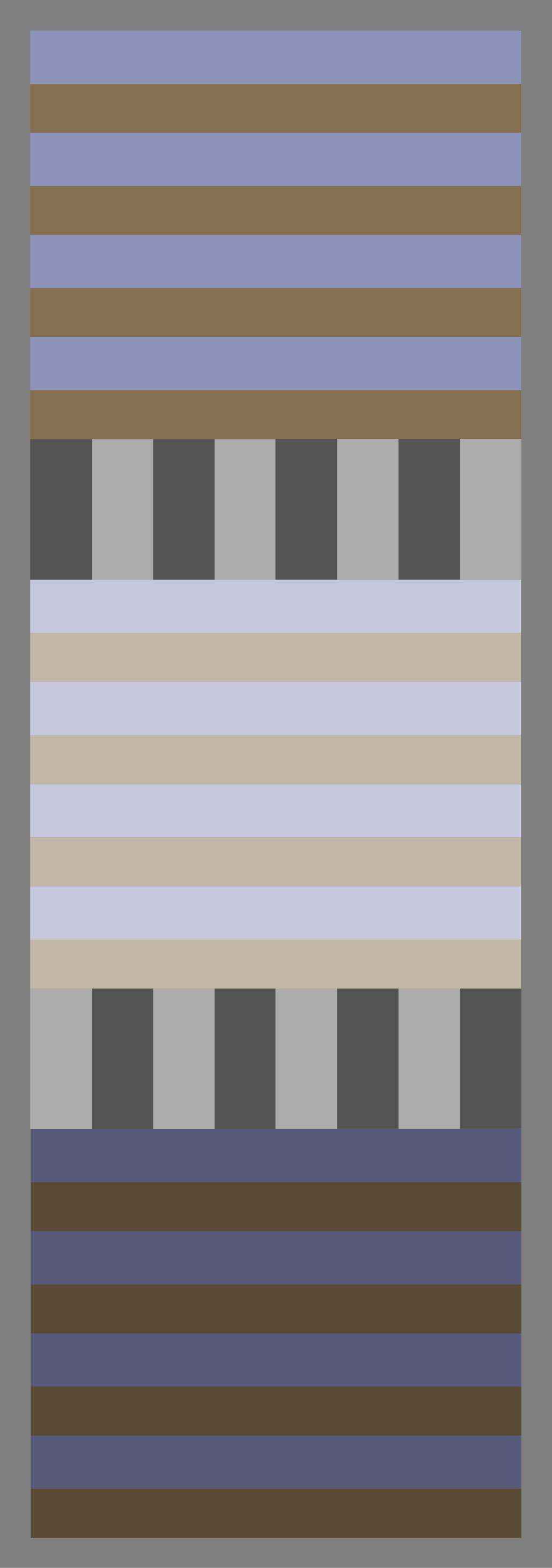
We can recreate these two effects by taking our original two colors and either shifting them away from white (recreating the effect of perceiving something against a white background), or shifting them towards white (recreating the effect of perceiving something photographed with a light source behind it).
Here, I’ve corrected the saturation and blackness values 1/3 of the way from the original (left) towards pure white (center) or pure black (right):

And here, I’ve corrected all three RGB values 1/3 of the way from the original (left) towards pure white (center) or pure black (right).
So, when you look at the dress, part of your visual system is saying, “Wow, everything is so bright! This dress must actually be really dark in order to look like this!” But another part of your visual system is saying, “Wow, what a horrible shadow! This dress must actually be really bright in order to look like this!”
What is so cool about the picture is that it seems to trigger both of these corrections in roughly equal measure. But just as our perception of a duck-rabbit picture snaps back and forth between duck and rabbit (but it is hard to see both at the same time), our brain chooses one of the two interpretations of the dress photo, and jumps in with both feet. Small differences in our visual systems — or the specific details of the context in which we view the photo — determine which way it jumps. For instance, I find it easier to see the white and gold dress when I look at the top part of the photo (where the backlighting is strongest), and can see the blue and black dress best at the bottom.
Thank you for the first image which extracts the colors from the original photo and shows them without all the other context. I am in neither the white/gold camp or the blue/black camp. It looks light blue/gold to me.
We recently started watching the Brain Game videos on Netflix and the first episode discusses phenomena like The Dress.