Category Archives: Hemiscience

Welcome to the Plutocracy: House Edition

So, earlier I posted a map showing the average estimated net worth of the Senators from each state. Here is the companion map for the House of Representatives.


Like the Senate wealth map that I posted earlier, this map was constructed on TargetMap using data from the Center for Responsive Politics. As before, these are estimates of net worth, and the numbers I have used are the average of the minimum and maximum estimates. It should be noted that the difference between the minimum and maximum estimates is typically quite large.

I have used the same ranges for the color schemes on the two maps, so you can compare them directly.

Welcome to the Plutocracy: Senate Edition

So, you know how it’s supposed to be harder for a rich man to get into heaven than for a camel to pass through the eye of the needle.* Well, two things:

     1) That’s not as hard as it seems, since a sufficiently rich man can pay to have people build him a huge-ass needle.

     2) In fact, it is not as hard as a poor man being elected to the United States Senate.


If you go to the original, you can scroll around and zoom in and stuff. If not, all you need to know is that Alaska and Hawaii fall in the puke-green colored,  greater than 1 million, but less than 3.16 million category.

This map was constructed on TargetMap using data from the Center for Responsive Politics. These are estimates of net worth, and the numbers I have used are the average of the minimum and maximum estimates. It should be noted that the difference between the minimum and maximum estimates is typically quite large.

What I find interesting here is not so much the relative numbers, but the absolute scale. Note that it is only the green states where the Senators are (on average) NOT millionaires. The red states are where the average net worth is greater than 31 million (10^7.5, actually).

Next up: The House of Representatives.

––––––––––––––––––––––––––––––––––––––––––––––––––––––––––––––––––
* Or, for the Lolcatarians out there, it is to fit a Great Dane into a tiny cat carrier than for a Fancy Feast kitty to go to the Ceiling (Matthew 19:23-24):

23 Den Jeezus sai to hiz desiplz, “Im teh srs, it teh sux 4 a rich kittn to go 2 teh Ceiling.24 Aiz tel yu geiz agin, it srsly moar easier 4 graet daen to fit in teh tiny cat cariur dan for fancey feast kitteh two go to teh Howse uf teh Ceiling Cat.”

Clarification on Sonic locations

So, in my previous post, I implied that Sonic Drive-In restaurants are primarily a Southwestern phenomenon. On twitter, @ElenaMorning pointed out that they have Sonic in the East and in the Midwest.

Fortunately, here comes . . .

Science!™ to the rescue!

Using data from the Sonic website, and the 2010 census numbers, I have calculated the number of Sonics per million people in each state. (To be fair, “calculated” overstates things a bit.) The pattern is centered on Oklahoma and Arkansas, and reaches much farther east than I had realized. So, it is perhaps better characterized as a south-central phenomenon. My apologies and respect to @ElenaMorning.

Here’s a visualization, created using Targetmap:


Feel free to refer to this map when deciding where to live next.

Can you spell scrappy without crappy?

So, I’m among those who believe that a baseball player only gets a reputation for being “scrappy” if they are not very good. You only get called scrappy if you scramble around and smother a ground ball that a fielder with better range would have gotten to easily. (I’m looking at you, David Eckstein.)

I decided to address this question by collecting some data that really has nothing to do with the original question. Using a method similar to that used by the Negative Log Google Naked Ratiometer, I looked at each position to see how often the position was referred to as “scrappy” and how often it was referred to as “crappy.”

For example, the Log Scrappiness for second basemen is calculated by taking the logarithm (base 10) of the number of google hits for “scrappy second baseman” divided by the number of hits for just “second baseman.” Similarly for Log Crappiness. Positions are more often referred to as “crappy” if they are higher on the graph. They are more often “scrappy” if they are further to the right.

If we look at the infielders and outfielders separately, the positions fall close to two straight lines with similar slopes.[1] Within each group, the relative scrappinesses are more or less what you might expect. The interesting thing is that each group has an inverse relationship between scrappiness and crappiness.[2] The scrappier a position is, the less crappy it is.

The solid diagonal line is the iso-(s)crapocline, or the line indicating equal scrappiness and crappiness. First basemen (1B), left fielders (LF), and right fielders (RF) are crappier than they are scrappy. Third basemen (3B), shortstops (SS), second basemen (2B), and center fielders (CF) are more scrappy than crappy.

Pitchers and catchers were left off, since there is too much cross talk on Google with non-baseball uses.

But, let’s get back to the original question: “Can you spell scrappy without crappy?” One answer is, “Yes, if you spell it in Albanian.” Via Google Translate: you can definitely spell i copëzuar without i mutit.

—————————————————————————————-

[1] You may have noticed that these straight lines represent power laws. If I were a physicist, I would say something about universality classes, and publish this blog post in Physical Review E.[3]

[2] This seems to violate the assertion I made at the beginning of the entry, but the right way to do address that question would actually be to look at how often “scrappy” is used to describe individual players, and then to compare this to an objective measure of crappiness, based on player statistics.

[3] Oh, SNAP!

Google Violates Benford’s Law, Arrest Warrant Issued

So, Google has already had it’s Twitter account subpoenaed, and can look forward to months of molestation enhanced screening at the airport, all thanks to its brazen violation of Benford’s Law.

What is this Benford’s Law thing?

It is a statement that if you look at lists of numbers in empirical data, the first non-zero digit is distributed in a very specific way. At least for certain kinds of data. Specifically, if the logarithms of the numbers you are looking at are uniformly distributed, then the first digits of those numbers will be Benfordly distributed.

Here’s what the relative probabilities of different first digits look like:

Here’s a graphic that shows the frequencies of different letters and numbers in Google searches. The numbers are way down at the bottom.

Image via Gizmodo

The thing that you’ll notice about this is that 6 is by far the most common digit (and that J/j is sad). Here’s a plot of these relative frequencies on the same scale as the Benford’s Law plot above.

Roughly speaking, this plot has the same shape as the one above, except for the fact that it includes 0, and that 6 is crazy. But, look at where the 0 value is: pretty much even with where you might expect the 6 to be. What happens if we assume that this was actually a transcription error that happened somewhere along the way? If we switch the 6 and 0 values, and then look at the relative probabilities of all of the non-zero digits, we get this:

The dark blue dots are the Benford’s Law points that we showed before. The reddish squares are the new empirical distribution.

Now that we’ve switched the 6 and the 0, we get something that looks to me like a mixture of the Benford’s Law distribution and a uniform distribution. But remember, Benford’s Law applies to first digits. This is data from all google searches. So, that’s going to be a mixture of first digits and non-first digits.

If we assume that 35% of the non-zero digits in searches are first digits, and that the other 65% are uniformly distributed between 1 and 9, we can back out the relative frequencies of the digits specifically in the first digit context.

The blue circles are the Benford’s Law expectations, and the red squares are the inferred empirical distribution of first digits. The choice of 35% was established through manual trial and error, and the fit was done by visual inspection. So, you know, don’t go and make any medical decisions based on this.

This is actually a reasonably good fit for this sort of thing, and constitutes fairly compelling evidence in support of the “sumbudy dun messed up” theory to my mind. Either that, or you have to invoke roughly 6 billion instances of people googling ‘666’.

Frank Benford (1938). The law of anomalous numbers Proceedings of the American Philosophical Society, 78 (4), 551-572

Introducing the Negative Log Google Naked Ratiometer

So, one of the interesting things about having a website is that you can track the keywords that people Google that lead them to you. I get a lot of hits from people searching on “Jon Wilkins naked.” It turns out that’s not as exciting as it sounds. One of the other Jons Wilkins is one of the cofounders of the marketing firm Naked Communications. So, I assume that some fraction of those people were actually looking for him.

It got me interested, though, in the relative web presences of “Jon Wilkins” and “Jon Wilkins naked,” and, by extension, in the relative naked and non-naked web presences of people in general. I’m going to call this the Negative Log Google Naked Ratio (NLGNR): the ratio of the number of hits when you Google “[Person’s Name] naked” to the number of hits when you just Google “[Person’s Name]” in log base 10. Negative.

Here’s an example. When I searched for “Kanye West” today, Google found approximately 38,600,000 hits. I then searched for “Kanye West naked” and got approximately 428,000 hits. The ratio of these two is about 0.011088, and the logarithm base 10 of that is about –1.95.

So, Kanye West’s NLGNR is 1.95.

If your NLGNR is 1, that means that 10% of all of the hits for your name actually come from pages where your name is followed by the word “naked.” If your NLGNR is 2, it is one in a hundred pages. NLGNR of 3 means one in a thousand, and so on.

Just like in golf, low scores are better, assuming that your goal is to have your internet presence primarily associated with nakedness.

I did this for 93 people, and I have to tell you the internet is a weird place. Before presenting the whole chart, here are some of the highlights.

Top among the people I surveyed was Mia Hamm, whose NLGNR is an impressive 0.83. That means nearly 15% of the sites containing the phrase “Mia Hamm” contain the phrase “Mia Hamm naked.” Weird? No. That actually seems low to me.

Mia’s equally dreamy husband, Nomar Garciaparra, came in 64th, at 4.52.

Number two on the list, just behind Mia Hamm? Rosalind Franklin, who edges out Charlie Sheen. Umm.

Where is Jon Wilkins in all this? My NLGNR is 2.32, just behind Angelina Jolie, Lindsay Lohan and Britney Spears, and just ahead of Kathy Griffin, LeBron James and Queen Elizabeth.

Other weird stretches: just behind Kanye West come, in order, Anderson Cooper, Marie Curie, Ron Jeremy, Kim Kardashian, and Bill Nye.

Yes, Bill Nye the Science Guy has almost as high a ratio of naked to non-naked web hits as porn icon Ron Jeremy. And, yes, both of them have lower ratios than Marie Curie.

Betty White beats out Saddam Hussein and David Beckham.

Barney Frank beats out Ke$ha.

Glenn Beck beats out Maya Angelou, but just barely.

Most of the poets appear way down at the bottom of the chart, which makes you wonder, what’s the point of being a poet at all.

Evolutionary biologists did even worse, with many having absolutely no naked internet presence.

A bunch of people actually returned zero naked hits, giving them infinity for their NLGNR. Most impressive among these was “Ted Williams,” whose nearly 46 million hits cover both the Red Sox legend and the golden-voiced, formerly homeless internet sensation. Others, from most non-naked hits to least, include: Jerry Coyne, James Watson, Francis Crick, HRP-4c, J. B. S. Haldane, Stephen Jay Gould, Louis Macneice, E. O. Wilson. John Ashbery, Doris Kearns Goodwin, Jorie Graham, Ronald Fisher, Sewall Wright, and Richard Lewontin.

I’m afraid I could not bring myself to do the analysis for Justin Bieber.

The 78 finite NLGNR scores at time of publication

Find any other interesting NLGNR scores? Add them in the comments.

State-by-State FST(ish) Values: The Structure of Racial Diversity in America

So, in the world of population genetics, as in the real world, people are often interested in diversity, and in how that diversity is distributed. In biological contexts, quantifying these things is important because it gives us insight into the processes – like reproduction, migration, selection, etc. – responsible for generating the observed patterns of diversity.

Here I look at how racial diversity is apportioned among counties (or county equivalents) in each of the 50 states, using two different statistics derived from the population genetics and ecology literature. Hit the jump for the analysis, and scroll down to skip the introduction and go straight to the maps.


One of the earliest and most enduring quantities in population genetics is FST. This quantity (along with various closely related “F”s with different subscripts) is an attempt to create a metric of population differentiation that is independent of the overall level of diversity. There are a variety of ways of formulating FST, depending on the type of data you’re thinking about, but all are something like this:

FST = (Db – Dw) / Db

Here, FST is a measure of differentiation between or among subpopulations. Dw is the diversity within subpopulations, and Db is the diversity among subpopulations. As you can see, if you simply double the level of diversity (both within and among subpopulations), this measure of differentiation will be unchanged.

The concept of FST was developed 80-90 years ago, primarily by Sewall Wright, who examined and characterized some of its properties within highly simplified and idealized models of population structure. Then, 40-50 years ago, people started thinking about ways to estimate this quantity from genetic data. A lot of FST-related statistics have been developed, but I will described just one here, which compares the observed and expected levels of heterozygosity:

GST = 1 – HO/HE

HE is the observed level of heterozygosity. Roughly speaking, we look at some gene all of the individuals in the population. Each person has two copies of the gene. If the two copies are the identical, the person is homozygous; if they are different, the person is heterozygous. The observed heterozygosity simply the fraction of people who carry two different copies.

The expected heterozygosity, HE is calculated by taking all of the genes in the population and mixing them together. Now, draw two gene copies at random and ask, what is the probability that the two gene copies are different?

If the population is completely well mixed, HO and HE will be nearly the same, and GST will be close to zero. Elevated levels of GST result from non-random mating. For example, if the population consists of two isolated subpopulations, those subpopulations will tend to contain different versions of the gene, but there will be no one who has one copy of a variant from subpopulation 1 and a variant from subpopulation 2. Thus, there will be a reduced number of heterozygotes in the population, relative to what you would get if you mixed all of the genes in the two subpopulations together.

This notion of heterozygosity is not limited to genetic contexts, however, and we can do the equivalent calculation for any trait that can be divided into distinct categories (even if those categories are somewhat arbitrary social constructs like “race”).

Here’s an illustration. I have taken data from the 2009 American Community Survey, aggregated at the level of individual counties. I calculate the “observed heterozygosity” from the frequencies of different races in each county. Imagine that within each county, we paired people at random. The HO calculated here is the fraction of these randomly paired couples who would have mixed-race children. In this calculation, I have assumed that if one parent self-identifies as “two or more races,” the children are mixed race, independent of the race of the other parent. Also, for simplicity, I have aggregated all subdivisions of “hispanic” into a single category. The HE here is calculated from the same random-mating procedure applied at the level of the entire state.

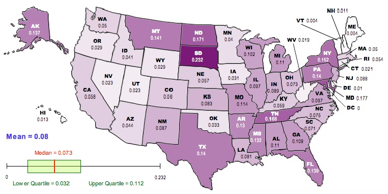
Here is a map of the results, generated using the free, online map generator from the National Council of Teachers of Mathematics:

Darker colors correspond to higher values of GST.

Now, it has been known for a long time that FST is not particularly well behaved. It is sensitive to things like the total number of distinct gene variants in the population and the total number of subpopulations. Recently, researchers have begun developing corrections to estimators of FST that are more robust to these deviations from the ideal models originally studied by Wright. One such correction was published a couple of years ago by Lou Jost, who proposed a metric, D, which demonstrably has many desirable properties that we would like to see from a statistic that describes population differentiation. In terms of the heterozygosities that go into GST, D is calculated like this:

D = [(HE-HO)/(1-HO)][n/(n-1)]

where n is the number of subpopulations. We can recalculate the racial “population differentiation” at the county level for each state. The new map looks like this:

As in the previous map, darker colors represent higher values of D.

Now, there are a lot of reasons to exercise caution in interpreting these values. The Jost correction used to generate the second corrects for certain problems associated with GST, but there is still an issue in that this analysis is based on aggregation at the county level. The geographical extent of counties varies enormously from state to state; the meaning of being in the same county in Utah is quite different from being in the same county in New York. Furthermore, the frequencies and identities of the groups vary among states in a way that will matter much more to any sociological analysis than will the numbers presented here. The FST-related statistics used here have been developed in the context of biological data, with the goal of understanding biological processes that are not necessarily analogous to the social processes that have driven the distribution of various groups in the US.

On the other hand, it is a lot more fun NOT to exercise caution. To that end, here is your list of the ten most racially differentiated states based on Jost’s D (second map):

Maryland, Texas, New York, Florida, Alaska, Mississippi, Georgia, New Mexico, New Jersey, California

And the ten least differentiated:

Vermont, Maine, New Hampshire, West Virginia, Iowa, Wyoming, Utah, Delaware, Minnesota, Idaho

If we go back to the raw GST (first map) the top-ten most differentiated are:

South Dakota, Maryland, North Dakota, Tennessee, New York, Montana, Texas, Pennsylvania, Florida, Alaska

And the least:

Vermont, Maine, Delaware, New Hampshire, Hawaii, West Virginia, Connecticut, Nevada, Utah, Oregon

I will leave irresponsible speculation and stereotyping of the residents of different states as an exercise for the reader.

JOST, L. (2008). GST and its relatives do not measure differentiation
Molecular Ecology, 17 (18), 4015-4026 DOI: 10.1111/j.1365-294X.2008.03887.x

On evolution and sequels

So, there are a lot of things in evolution that seem like they are moving in one direction, when actually they are moving the opposite way. Or maybe it’s the other way around – I forget. For instance, one of the things that we know is that the vast majority of naturally occurring mutations are deleterious. That is, just like your crotchety old grandfather always said, children are, on average, a little bit worse than their parents (and the music they listen to is A LOT worse). Yet, somehow, evolution is able to maintain a level of function in the face of these deleterious mutations, and even to create new adaptations.

The reason is natural selection. Children will be worse than their parents on average, but there will be variation. Some will be a lot worse, and some only a little worse. Some may even be a bit better. The key is that the better children will, on average, produce more grandchildren than the worse children will (so your nagging mother was also right). It’s a bit like walking the wrong way on one of those people-movers at the airport.

Of course, there is also noise in the system. Sometimes a big rock falls on the “fittest” individual in a way that has little to do with that individual’s genotype. And sometimes an individual carrying a lot of deleterious mutations starts a polygamous cult and has about a hundred kids. But on average, the filtering effects of selection seem to counterbalance, or even outweigh the effect of those deleterious mutations.

This got me wondering if there was maybe something similar going on with movie sequels. The conventional wisdom in most quarters is the movie sequels suck. Sure, there is the occasional Godfather II, but for every one of those, it seems like there are a hundred films that are closer to Highlander II. So, I did a little study [1], in which I compared three classes of films: movies that got sequels, movies that are sequels, and random movies. Two scores from Rotten Tomatoes were collected for each movie: the “tomatometer” score, which is the percentage of reviews of the movie that were positive, and the user score, which is the average rating (out of 10) by users of the site.

The average scores are:

Movies with sequels: 59.2% positive 5.92 average (coincidence, or Illuminati plot?)
Movies that are sequels: 44.8% positive 5.16 average
Random movies: 45.7% positive 5.21 average

So, what’s our conclusion here? Well, it seems like sequels are, on average, pretty darn similar in quality to the random sample of movies. The outlier is the set of movies that get sequels made. So, maybe we think that sequels suck because we tend to mentally compare them with the originals, and, like our high-school sports careers, they fail to live up to expectations. Maybe sequels suck because movies suck, and a sequel is no more or less likely to suck than anything else. Or is there something about sequelness in itself?

We can drill a little deeper by dividing our movies into five quintiles (with ten movies each) based on the tomatometer scores of the originals:

Bottom quintile:
Movies with sequels: 17% positive 3.6 average
Sequels of movies: 15% positive 3.6 average

Second quintile:
Movies with sequels: 45% positive 5.2 average
Sequels of movies: 22% positive 4.0 average

Third quintile:
Movies with sequels: 58% positive 5.9 average
Sequels of movies: 49% positive 5.3 average

Fourth quintile:
Movies with sequels: 82% positive 7.0 average
Sequels of movies: 64% positive 6.1 average

Top quintile:
Movies with sequels: 94% positive 7.9 average
Sequels of movies: 74% positive 6.8 average

What this makes it look like is that there really is something about making a sequel that makes your movie suck more than the original. For the most part, you can expect a 15-20% drop in the number of favorable reviews going from the original to the sequel, even if the sequel was only average to begin with. The one exception is the bottom quintile, where you can expect your sequel to suck just about as much as the original did. This may be a boundary effect, as the average number of positive reviews is bounded at zero. This is the great thing about making “Baby Geniuses 2” is that it is virtually impossible to underperform “Baby Geniuses.” On the other hand, with a tomatometer score dropping from 2% to 0%, the baby geniuses somehow managed it.

———————————————————-

[1] Not-very-scientific study methodology:

In order to collect a sample of sequels, I went to Rotten Tomatoes, and searched for “2” and “II,” discarding anything that was obviously not a sequel, or for which there was no rating information available. This yielded a list of 50 movies, including “2 Fast 2 Furious,” but not “Aliens.” For each of these, I got the “tomatometer” score and the average user rating for that movie and for the movie of which it was the sequel.

For the random sample, I went to The Movie Insider, and used their list of January-June 2009 releases. I discarded anything that was a foreign film or documentary that had an initial release date prior to 2009. The rationale here was that if a documentary is shown at film festivals in 2007, and then gets a major theatrical release in 2009, this is not a random movie. It is a movie that has already undergone a fairly intense selection process. In the end, this list had 75 movies in it.

The study was not double-blind or vetted by anyone else, and undoubtedly contains errors in both transcription and judgment. However, hopefully it is close enough for analogic use.